As a primary school child, I was already dreaming of Hawaii. A few months ago Chrisek posted some photo's of a round trip on the Big Island on WatchuSeek. When I heard he was buying an "Endless Summer"model, I could not hesitate to ask him to write an article about this model on 50 Gs. It could not been written better than from someone from Hawaii [Sjors].
Hello, I’m Chrisek and I am celebrating my first year into G-Shocks. After trying many different styles of G’s I’ve fallen particularly hard for the Gundams (DW-81XX). Sjors in particular can claim some responsibility for this with his reviews of the
Red,
Green, and
Crazy Gangsters.
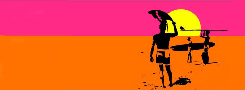
Some G’s are rare, not in the sense of overall price, but just not there to be purchased. I happened upon one of these on my G anniversary. Released in 1995 as a part of 4 limited edition/collabs the Endless Summer was to commemorate the movie release of Endless Summer II, but used the artwork from the original movie.Casio was charging a whole $10 more for the limited edition over the similar DW-8150 and DW-8050. Functionally there are no differences or extra features on the watch. The story goes that when the director (Bruce Brown) and Star/Principal Surfer (Patrick O’Connell) visited Japan to promote the movie, they were presented with one of these each.


The 4 models are: DW-8060D-1 (black), DW-8060D (“the blue one”), DW-8160D-1A (blue), and the DW-8160D-1B (brown). Isn’t that nomenclature just weird? Normally the “D” following the model number designates a metal bracelet, obviously not so in this case. I’m guessing “decorative” strap. The color codes involved are just completely nutty. Technically the “1” in Casio-lingo is black. All good on the 8060. Blue should be “2”, and it might be on the blue 8060, but on the 8160, that isn’t the case at all! Likewise “5” should be used for brown or gold, not “1B”! Maybe this is before Casio standardized their color codes? Unsure . .. . . .


As already mentioned, these weren’t all that limited. Back in 1995 they were readily available for a small increase in price. What has made these models rare is resin rot. Underneath that metal plate (I love that exoskeleton look!) is a big chunk of resin, nearing 20 years old, a lot of those big chunks of resin have not stood the test of time well at all. Because of this more than anything else, the ones that are left just aren’t put up for sale that often. I had read a little about this model (not much is out there on the ol’ www), and when this one came up for sale, I just jumped on it. Ecstatic that I “got one” the hardest part has been hiding it (not putting it on line to share with the community at large) until this article comes out. Man Sjors is a taskmaster !


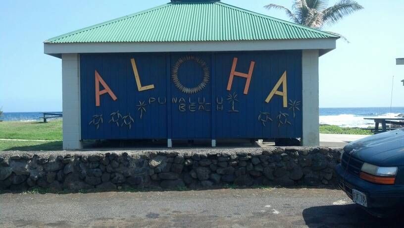
Living here in Hawaii, I do enjoy looking for various Triple Crown, Hawaiian Pro, and Surfrider Foundation watches as these all celebrate events within a few miles of me. This one with the infamous Surf appeal was simply too big a draw to not have. Especially with how little information is available on it.
Also because of Hawaii’s climate I’ve chosen to take photos in the sun on the sand and in the shade on the grass, hopefully you like the way the photos came out!
If you can’t already tell, the one I managed to get is the DW-8160D-1B. The brown one is handsome. Oh, the straps . . .. thought you might notice! When looking at the factory photos of these models you can’t help but notice that weird colored camo effect transparent band. In every real life photo I’ve only seen the band I have, the transparent brown. In any case I think it goes well with the coloring of the watch. Since there are no official pics with this band, I’ve taken it upon myself to show it off a little with extra photos of it. This way you know what you are looking at if the seller’s photos are dark or dim on the band. A couple of things I enjoy is the script of the writing (very “Battlestar Galactica”) and the gold metal keeper (seen similar ones on other limited editions).

On the watch face, it’s hard to miss the little waves. A very nice touch, and uncommon within Casio to change the display in such a way. Still the same function of a visual representation of the seconds. Of course, the other (and famous) differentiation is the EL display. As previously mentioned Casio adapted the image from the poster of the first movie. Turned out in a very charming way, definitely nice to look at. Frivolous touches like these make it very easy for me to enjoy G-shocks, and this one in particular.


1 comment:
Awesome! What a rare G. Even came out a year before the Extreme/G-Lide surfing watches.
Post a Comment