Casio has been experimenting with 3D prints this year. We already got a foretaste with the crocodile prints in October 2012. I still don’t own one, but I pretty much like the look of these models. In February this year the first Geometric G-Shock appeared on the market in The Netherlands. Remarkable, because this model was officially released in Japan in March 2013. It’s very rare that a certain model is released earlier outside Japan than in the home country itself.
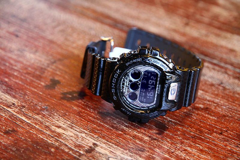
I simply had to have this one in my collection. Not that I really like it. I would have liked it more if it came in a different color. Maybe it would have looked best in blood red, like the Rising Red models. Not that it looks bad in black.
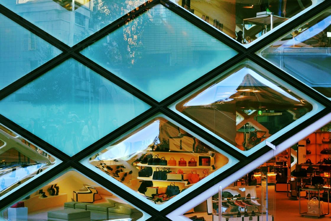
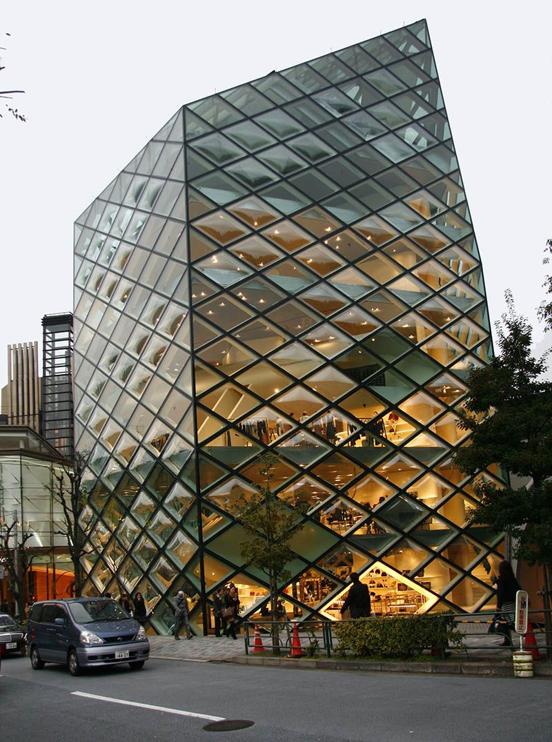
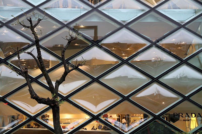
Photo above: Prada store Shibuya, taken by me, Photo below taken by Bernard Vercouteren van den Berge.
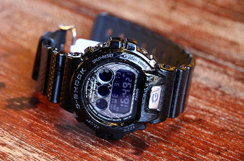
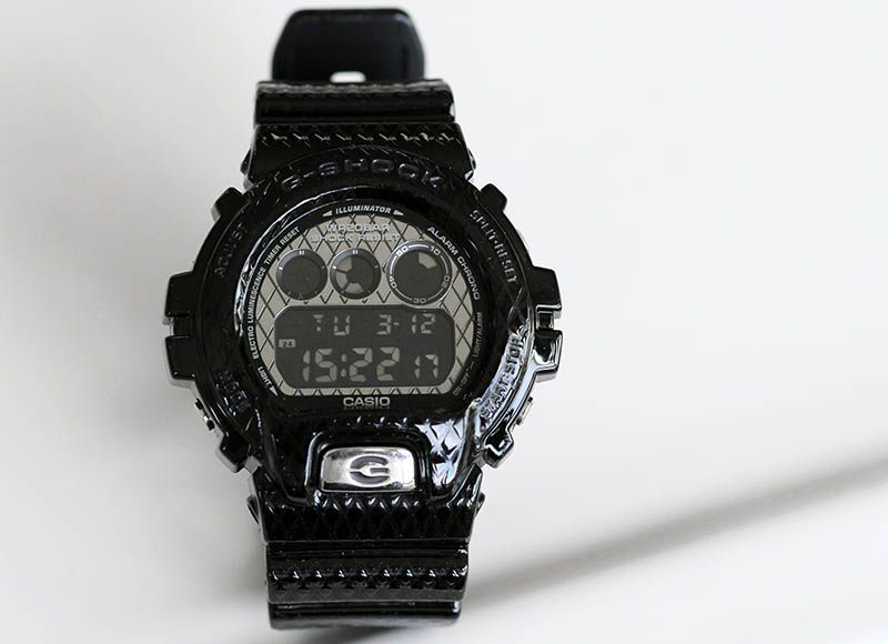
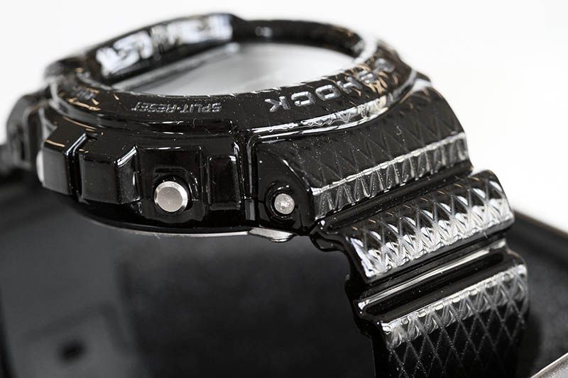
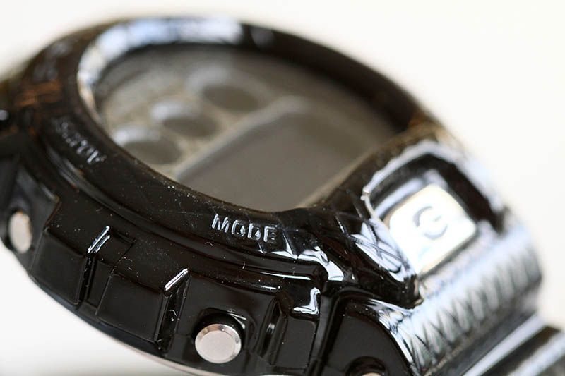
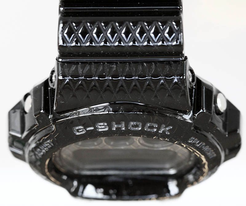
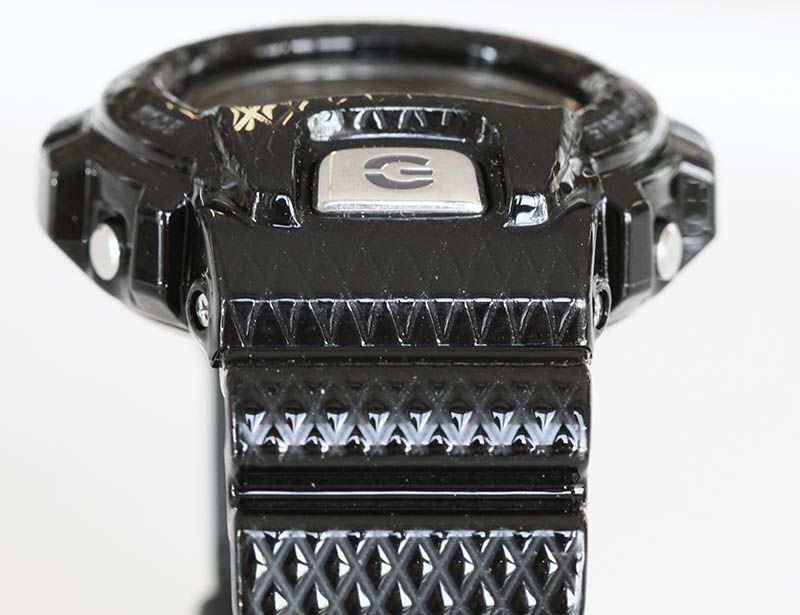
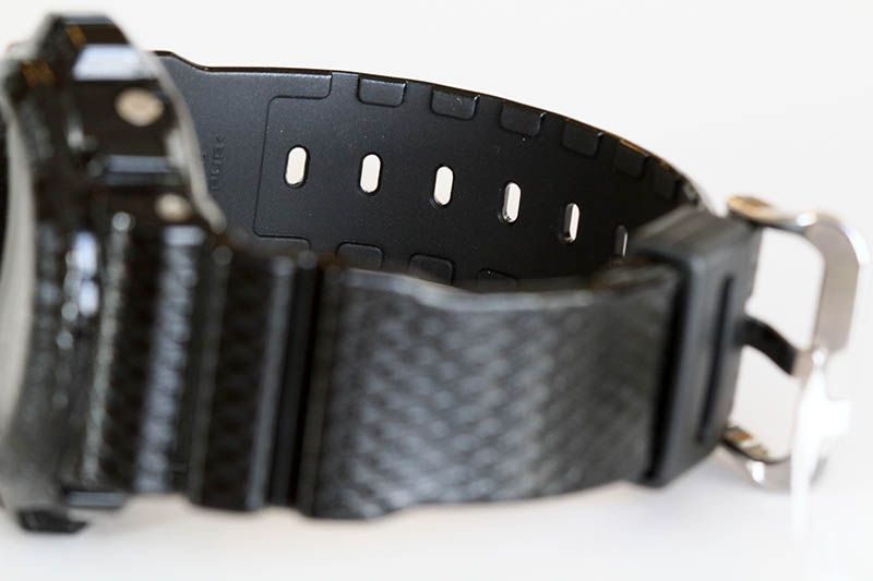
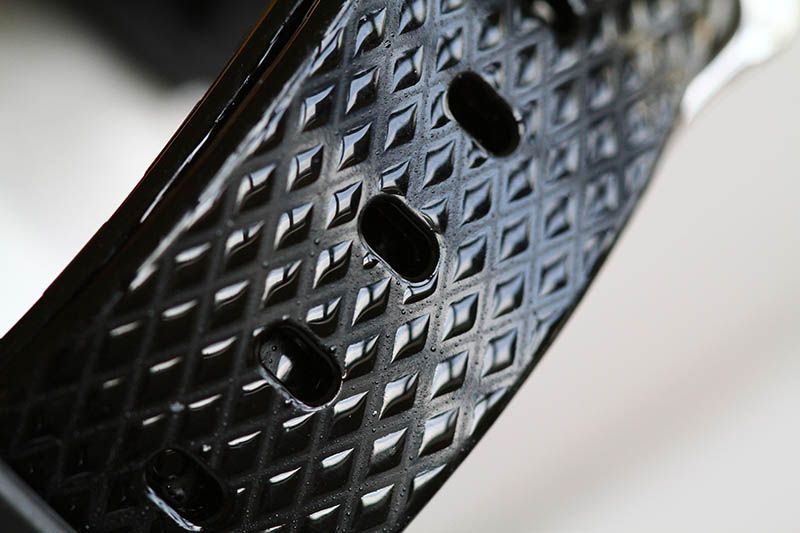
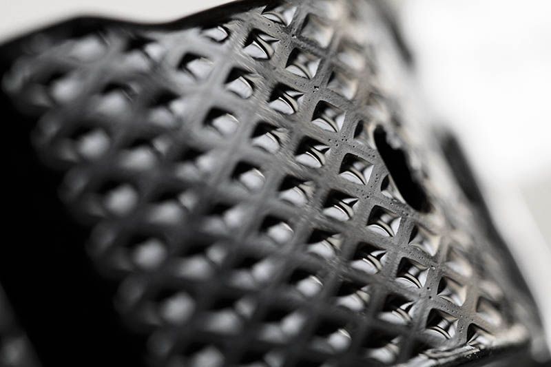
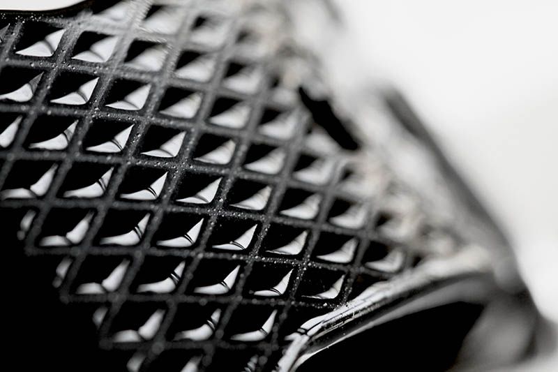
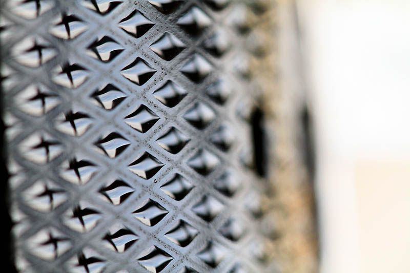
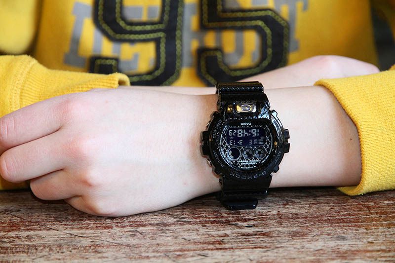
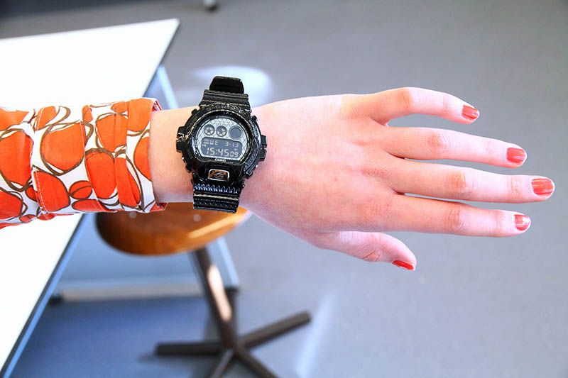
The texture of the strap, bezel and faceplate seems to be inspired by wallets and bags. This makes me think… Is this model made for women? I’m not sure. I think it looks pretty sturdy actually, for both men and women. The geometric forms somehow remind me to the Prada Store in Shibuya. Quite an unique building, which you won’t easily forget if you have ever seen it in real.
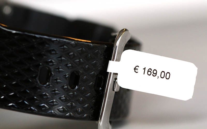
When buying this model, you have to swallow first. For a “basic” model, this model isn’t cheap. The croc models were, with €149.- already more expensive than a normal DW-6900, but this watch comes with a retail price tag of €169. Collaboration models are often cheaper. The reason for this are the special made molds. This watch is probably made in relative small numbers. Compared with the basic DW-6900 mold, which you can use for every other model made, the numbers are extreme small, no matter if 1000, 10000 or even 100000 are made. From a typical DW-6900 mold you can produce millions different 6900 type G-Shocks.
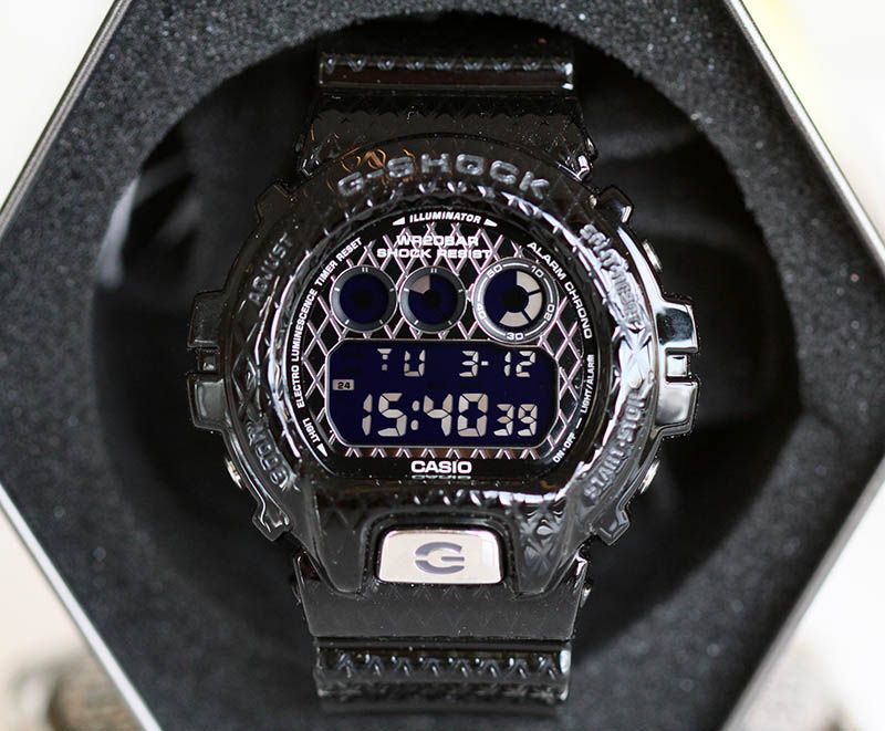
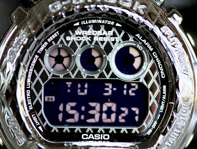
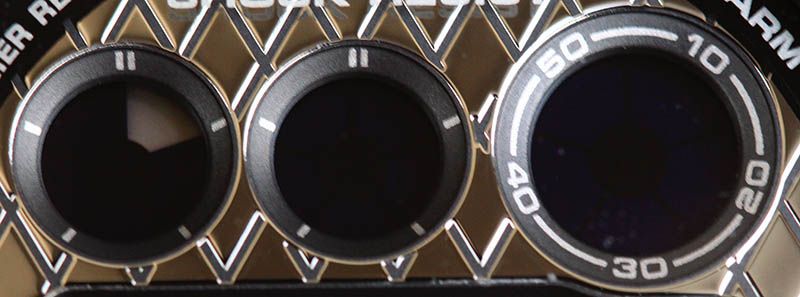
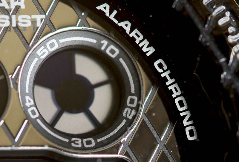
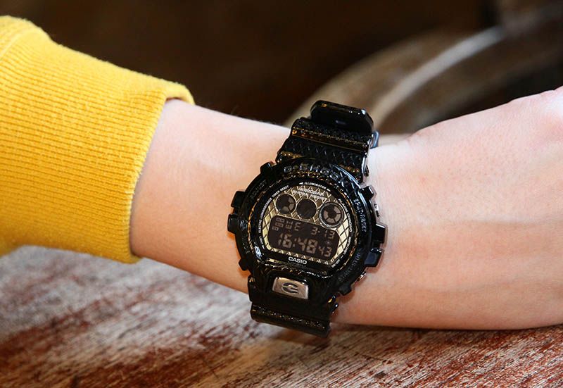
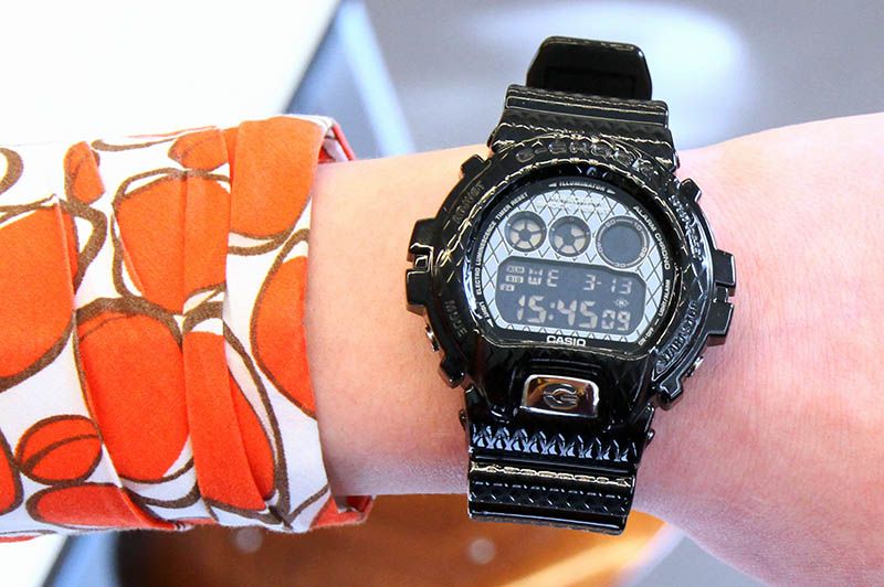
Pretty special is the face plate. Where the crocks have a mirror finish, this model has also a 3D print. This explains why this model is even more expensive than a croc. The faceplate has a partly black mirror finish, which gives it different unique looks under different light conditions. It’s like it’s made of anthracite.
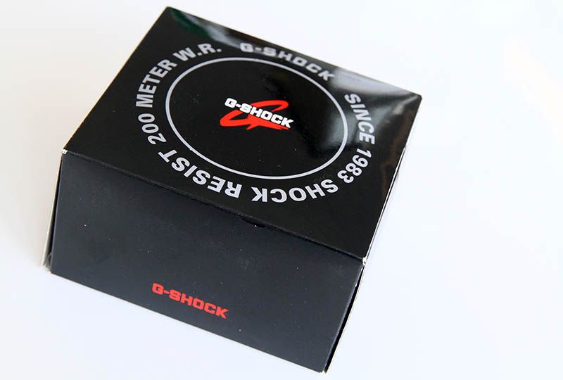
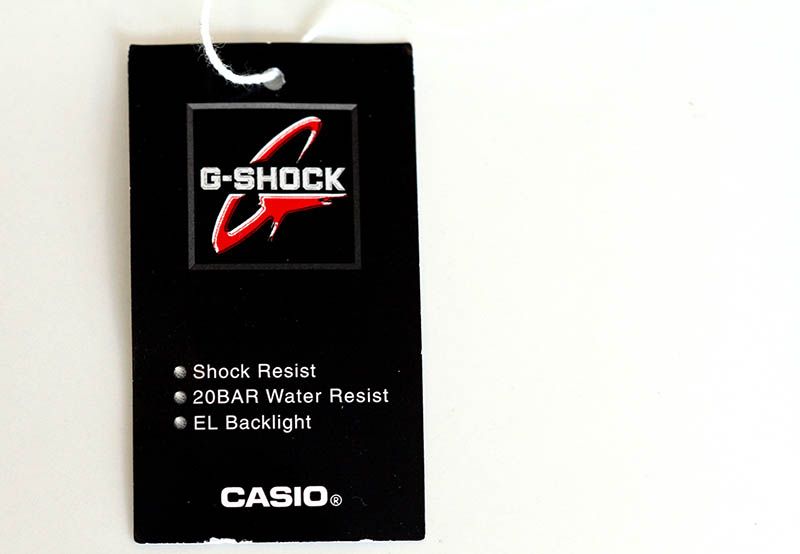
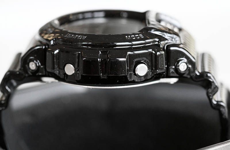
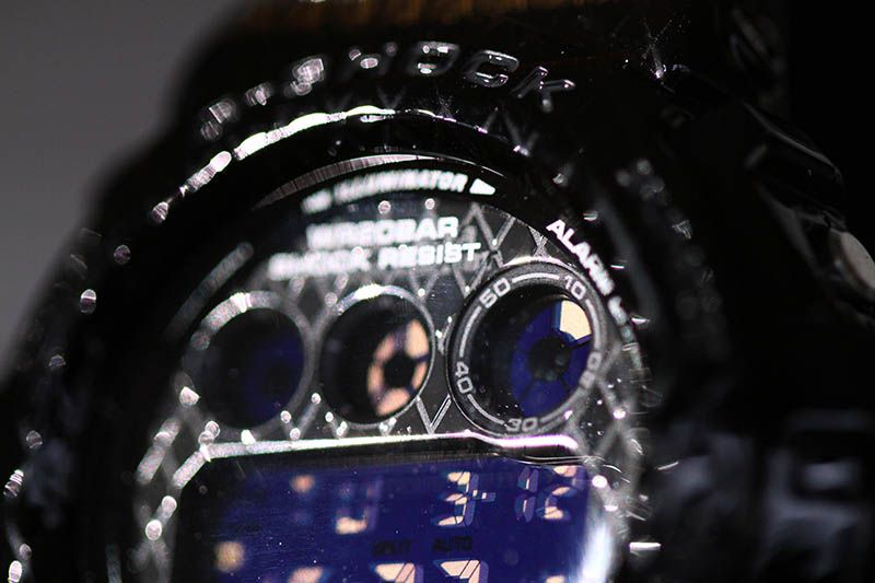
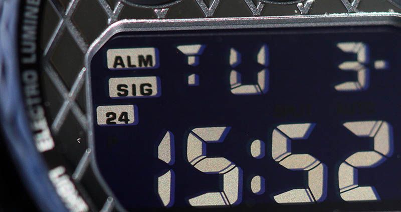
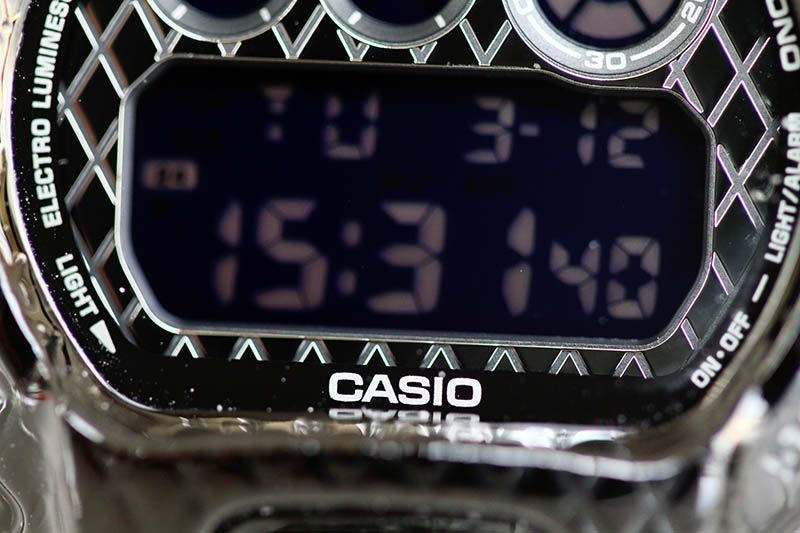
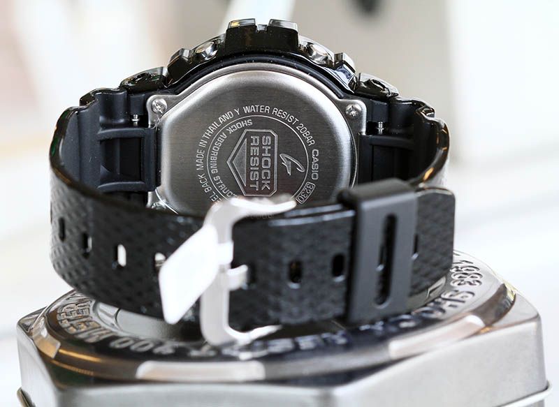
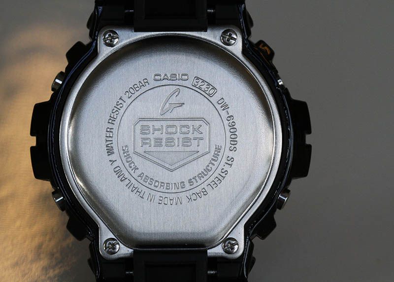
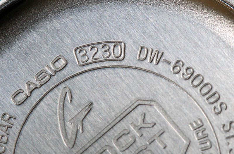
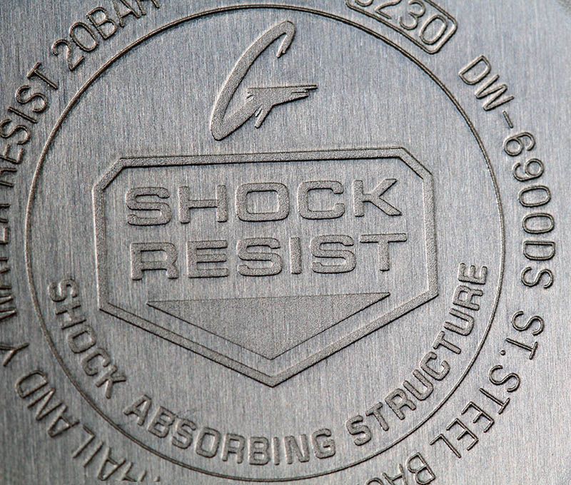
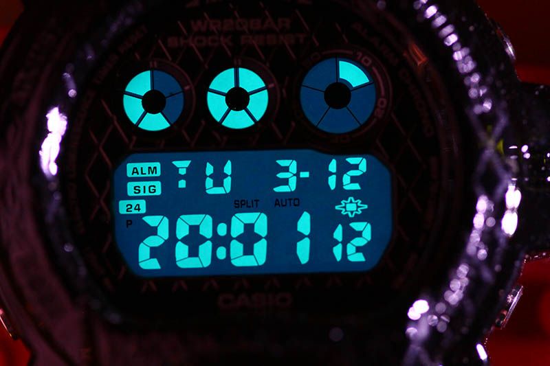
Pretty unusual is also the lettering on the crystal. Normally the CASIO brand lettering is located at the top of the display, now it’s at the bottom . The water resistance is abbreviated to WR20BAR and additionally “Shock Resist” is added. I don’t know if Casio has done this before, but frankly I like it this way. The text WR20BAR is also more logical. The water resistance is guaranteed until 20 bar. In static water that is 200 meters (about 600 ft), but in moving water or pressurized surroundings a 200 meter water column could generate more than 20 bar.


The “Geometric” G-Shock has a negative display. With such design, it is also the best choice for this model. I even think that a positive display would have looked out of place. There has always been discussion about negative displays (for those not acquainted with the term “Negative Display”, it’s a black or dark display with light gray or lighter colored digits) about the readability. Indeed, the old 90s models with negative displays were not always easy to read. I noticed it particularly while driving a car. In such situations, if you want to know time, you should be able to read it in a fraction of a second. I noticed the angle in such situations were not optimal. Well, actually, the display was almost complete black. Casio has improved the negative displays a lot in the past 10 years. Although, they are still a fraction harder to read than positive displays, I must say that this display does pretty well. Even under dim light conditions the display shows time crisp clear.


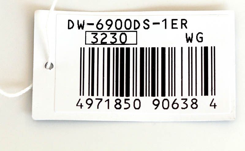
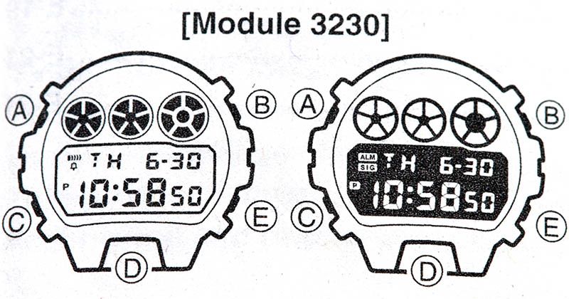
As all new DW-6900 models, the Geometric model also comes with thew new 3230 module. At first glance you won’t notice the difference between the 18 year old 1289 module, but the 3230 module, in use since July 2011, has an internal calendar that doesn’t stop at December 2039. I know that it is still 26 years to go, but there are still 30 year old G-Shocks up and running now. It might be 2039 before we know it (if I may experience that, I will be 73 years old!).
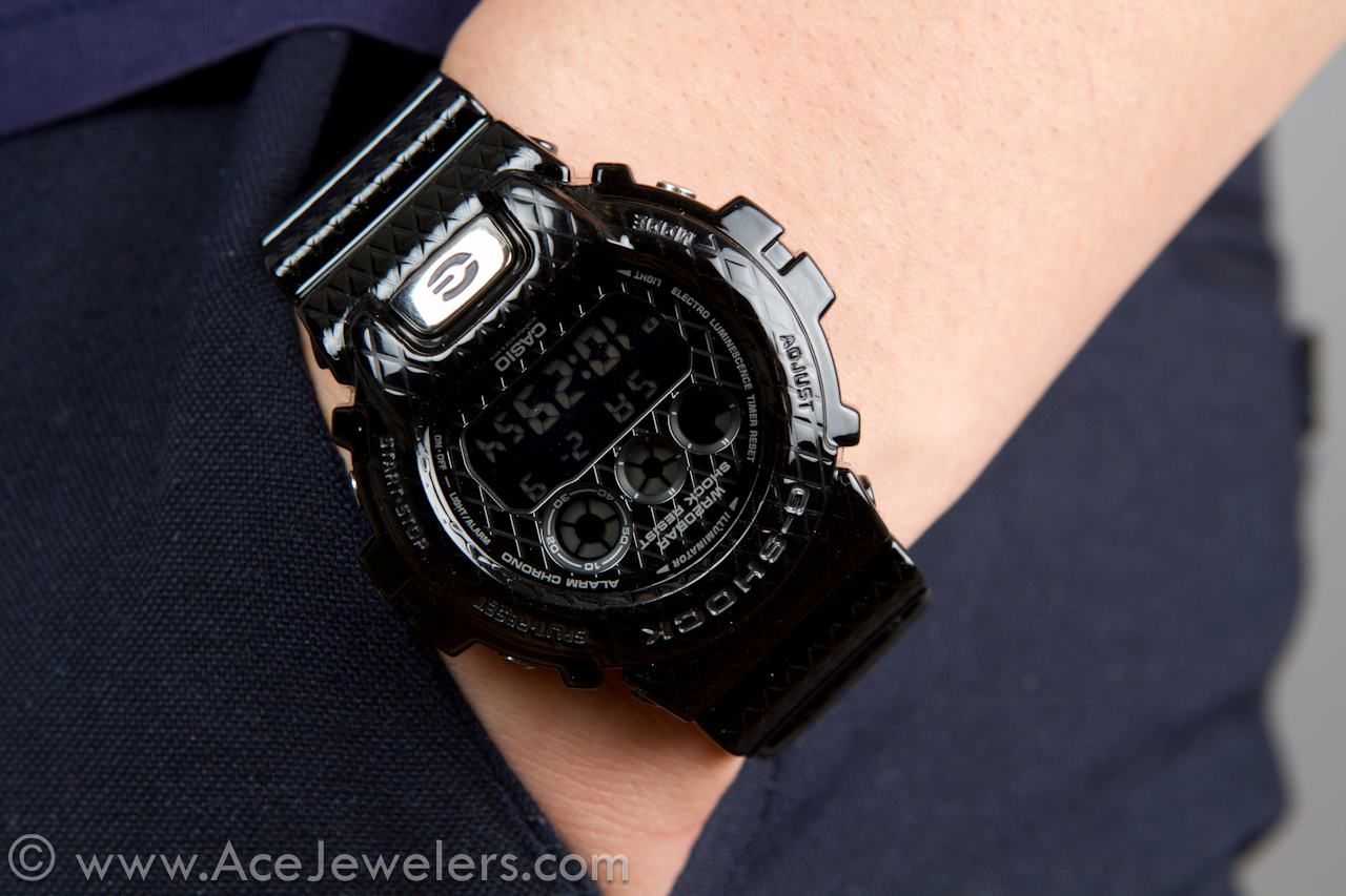
Kathelijne posing the DW-6900DS. As I think this watch might be more feminine, I asked her to pose with it.


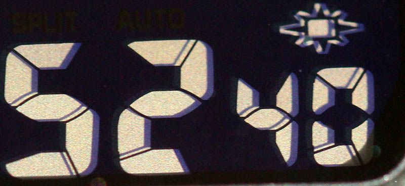
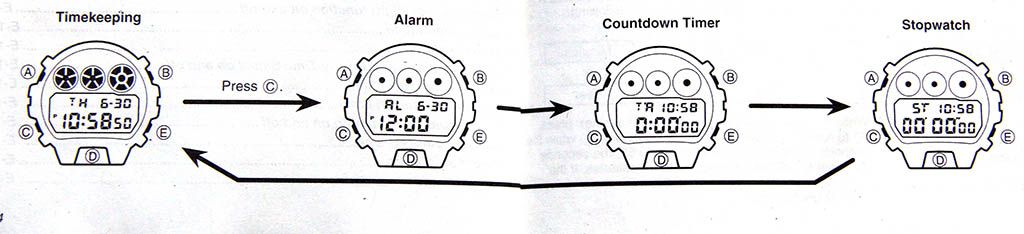
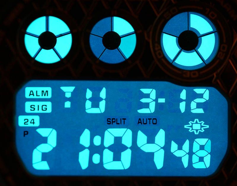
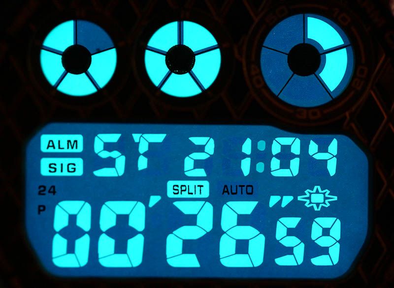
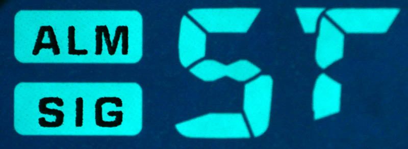
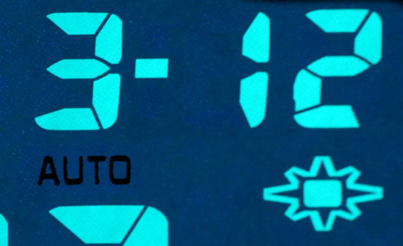
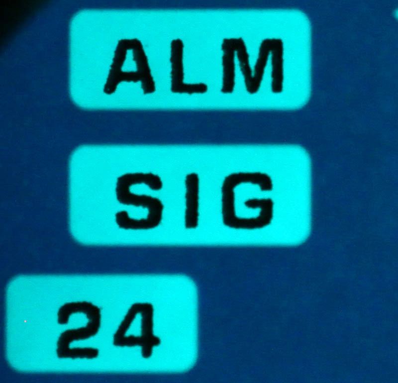
Well, it’s not the first DW-6900 model with a 1289 or 3230 module on board, so I will give only a brief summary what you can find on this model. The watch has a single Alarm function with a hourly time signal, a 24 hour Countdown Timer and a 24 hour Stopwatch. The Alarm function can be set as a Date Alarm. If you leave the digits blank it functions as a normal Daily Alarm. When one of the digits is left blank you can achieve a 1-Month Alarm or a Monthly Alarm. The Countdown Timer can be set to Auto Repeat. As a kind of extra, the watch has a Flash Alarm. When toggled on (press and hold the lower right button for about 2 seconds in Time Keeping Mode) a star like icon appears above the seconds. Whenever an Alarm sounds (except the button tones), the display flashes shortly. The popularity of the DW-6900 is probably not only for the looks, but also for the good pretty basic, easy to use functions.


It might be that this model is the result of a study experiment by Casio in how they can use 3D printing on a G-Shock. We already had the crocodile pattern models, so I won’t be surprised if other patterns will be applied on the strap, bezel or the face plate. As a snake pattern is also popular, maybe that’s what to expect next. It would be interesting if a model only has a 3D faceplate.
Beautiful or not, this building stands out.
Personally I bought this model, because of it is unique in the DW-6900 designs. I remember when I was in Japan, my friend, who happens to be an architect and has a good view on design asked me my opinion about a building in Shibuya. I couldn’t think about an opinion. It stood out of the rest, but somehow I could not decide if I would say it’s beautiful or if it was ugly. Somehow I have the same feeling with this watch. It looks different. I’m not really convinced I like it, though I also can’t say I don’t like it or it looks ugly. Fact is, that you have to pay quite more for this design. The higher price is simply the result of the more expensive production method for this model. Well, I would say, check out my photo’s and try to decide for yourself if you like this or not.
Check the date, the release was official March 2013!
I got mine from Ace Trends in Amsterdam. You can easily contact them on-line via Live Chat and Facebook. In case of this watch, I got it in only a few minutes ready to mail (Thanks Dale!). You can find a link in the menu on the right of my weblog (sorry, in web view only). They showed this model about a month ago, even before it was announced in Japan.


4 comments:
I still have not warmed up to these patterned G-Shocks. I definitely did not like the Crocs, I think those just looked broken and molten. This one I like better but I only like that pattern on the face plate. I hope Casio will make more of those. The pattern on the strap and bezel reminds me to much of those patterns we find on womens bags, wallets, belts and shoes.
Casio have still not succeeded in making the ultimate pattern that I like. I had the suggestion that Casio should make a vampire G, perhaps in transparent resin with fangs biting into the resin printed at the light button area. And then the transparent red blood pattern should flow down the bezel and strap. That I think would be awesome as a 3D pattern!
What did Kathelijne think of this, did she say anything?
I think that those buildings you posted looks very nice!
Sincerely Joakim Ågren!
Nice review! I think that this is just the beginning of the sculpted urethane. In the future it will be cool to see custom molded-in designs perhaps with different colors in the depressions by collaboration artists.
Nice write-up Sjors!
@ Sky,
Thanks for your comment. Well, I told Kat what my idea was and she said yes immediately.
@ Dorkinaut,
I think you hit the nail on the head. It is what I am thinking too. I see nice ideas for brand collabs, where the logo's are printed in/on the strap and/or face plate.
@ Dale, first of all, thanks for letting me know this watch was out. Glad you like the article.
Post a Comment